Logos for the Modern Web

Even today, most logos we encounter were conceived during the golden age of print. The problem with these brand assets is that they often can't be used strategically in digital spaces. How can you challenge an existing brand to evolve for more modern use?
As a visual designer at Message Agency, I’ve had the opportunity to work directly with clients to help translate and optimize their brands for digital experiences—most commonly, websites. We've developed an approach to evaluate ways of updating logos and other visual design assets to fit the modern web. Our conversations typically cover the following ground:
• Why Reformat & Reevaluate
• Understanding Logos and Responsive Design Systems
• Mobile Treatment and Its Variants
Why Reformat & Reevaluate
It's a common scenario: A client presents us with a meticulously designed logo, but one that was primarily conceived for use in print. In some cases, we receive guidelines to aid our branding efforts for the web, but clients can be surprised that we still have to review the assets and specifications against some key questions:
- What variations or range of approved logo structures exist within the brand?
- Is the client open to using just the one or multiple versions?
- Can alterations be made for special cases such as for varying screen sizes?
Depending on the answers to these questions, our role then becomes one of strategizing and auditing the logo structures to adapt them for new usages.
Understanding Logos and Responsive Design Systems
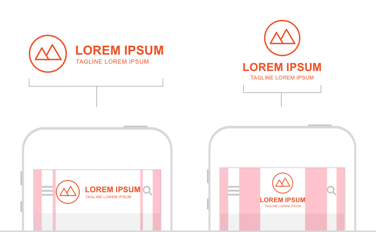
When considering the world of responsive web and screen design, brands naturally get an opportunity for a graceful extension across varied outlets that a user might encounter. This opportunity provides flexible layouts that can transition a logo's structure within a screen’s varying formats.
When we start this type of conversation with our clients, I like to draw a comparison between the traditional header region of a homepage and its cousin on printed letterhead. Similarly, we illustrate how a mobile header region reflects a downsized branding experience that also relates to the ways a logo may be presented on a business card.
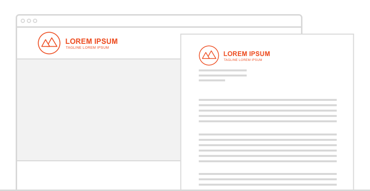
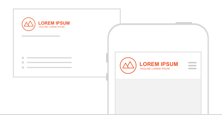
That analogy usually helps a client focus in on the opportunity to use both the primary logo structure along with a secondary or tertiary logo structure within a digital website experience.
To better explain that approach, we often will pose a happy middle-ground solution that will use a secondary logo structure within the header region and the primary structure within the footer of the website. To help clients understand this point, we spend time prototyping and testing how one or more logos will work across desktop and mobile header regions.
Mobile Treatment and Its Variants
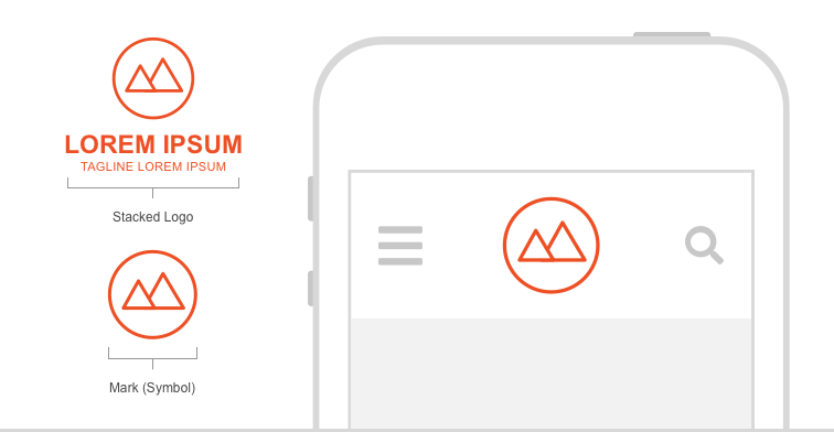
When strategizing about logo use on a mobile device, we evaluate how a minimized structure holds up against the following aspects:
- Readability
- Spacial Collisions and Negative Space Padding
- Formatting Possibilities with Subtitles
- Letting “The Mark” Breathe
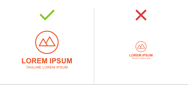
Readability
Designing with accessibility and user-centric thinking as core values, it goes without saying that readability is a very important standard. To evaluate a logo within a mobile header or footer structure, we make sure to review the legibility of the downsized copy in the logo's primary and tagline elements.
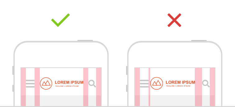
Spacial Collisions
For this evaluation point, we look at how the logo sits spatially between header elements. Most notably, we consider the relationship we see with the infamous “hamburger menu” or a search button graphic.
Formatting Possibilities
When reviewing a brand’s logo documentation we sometimes find that subtitles or taglines are flexible in how they can be treated or moved. This provides us with an opportunity to detach that text and run it under the mark in a tasteful manner. In many ways, this helps solve problems that may have also arisen during our evaluations.
Letting "the Mark" Breathe
In many cases, we find a client's name or tagline becomes very difficult to read when minimized to fit a somewhat limited mobile header region. Some modification of the mark may be needed. This can be a tricky conversation to have with a client who doesn't have approved variants of their brand and logo system or who has a reluctance to modifying their mark.
When discussing this edit, we like to share the following philosophy as a guideline: When liberating a mark from a structure, it doesn't undermine the brand; rather, because the mark is properly treated, it instills confidence in a brand. The trick is to present the mark in a way that has fidelity to the brand but the elegance of simplicity needed on a smaller screen.
As with any good design practice, no one design solution will solve every problem out there. However, our strategic evaluation, which we provided a snapshot of here, does provide flexibility and a framework to how logos can be translated to modern web experiences.